The key visual for Busan Biennale 2026 starts from the visual language of the street, including flyposting and club flyers commonly encountered in urban settings. Rather than a design refined by a singular order or system, the key visual for this year’s Busan Biennale focuses on the non-institutional, visual structures of cities, which are formed through the overlapping and collision of diverse modes of expression. Grounded in the concept of polyphony—and mirrored in the exhibition’s theme, “Dissident Chorus” —the key visual is realized as a type of “chorus” in which a single message is varied through myriad voices.
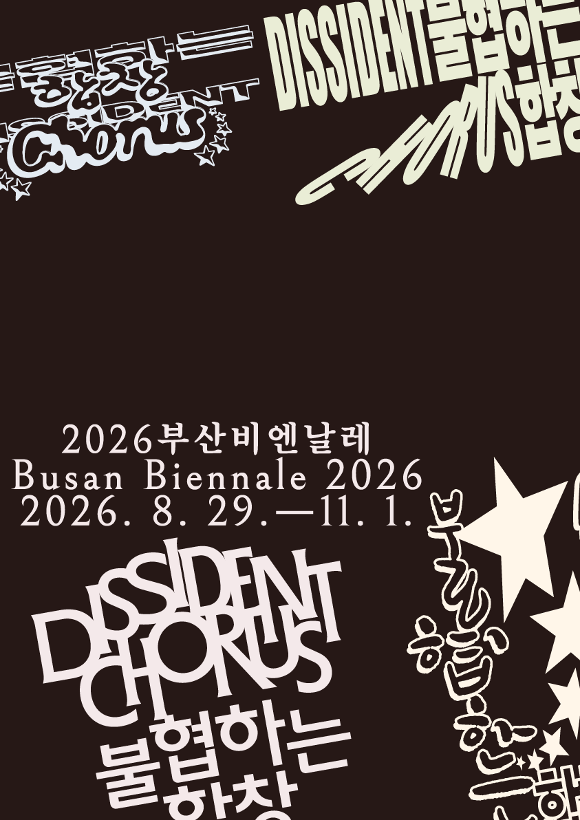
The dark background of the image is conceived as a stage upon which diverse graphic elements speak out. Across this background, twelve distinct typographic styles are repeatedly arranged and layered, with a pastel color system emerging subtly against the dark stage that simultaneously reveals coexistence and tension among the disparate elements.
Meanwhile, the informational text for the exhibition is set in a comparatively refined typeface, creating a contrast with the freely varied typography and establishing visual balance within the overall composition.
At the heart of the main visual for Busan Biennale 2026 is its expandability. The design asset will be made publicly available for anyone to use, allowing outcomes reproduced in different contexts to accumulate as additional “voices.” As this process gains traction over time, it will operate as one layer in the formation of a collective chorus for Busan Biennale 2026.